Looperator GUI & UX Design
Category: Case Study @en
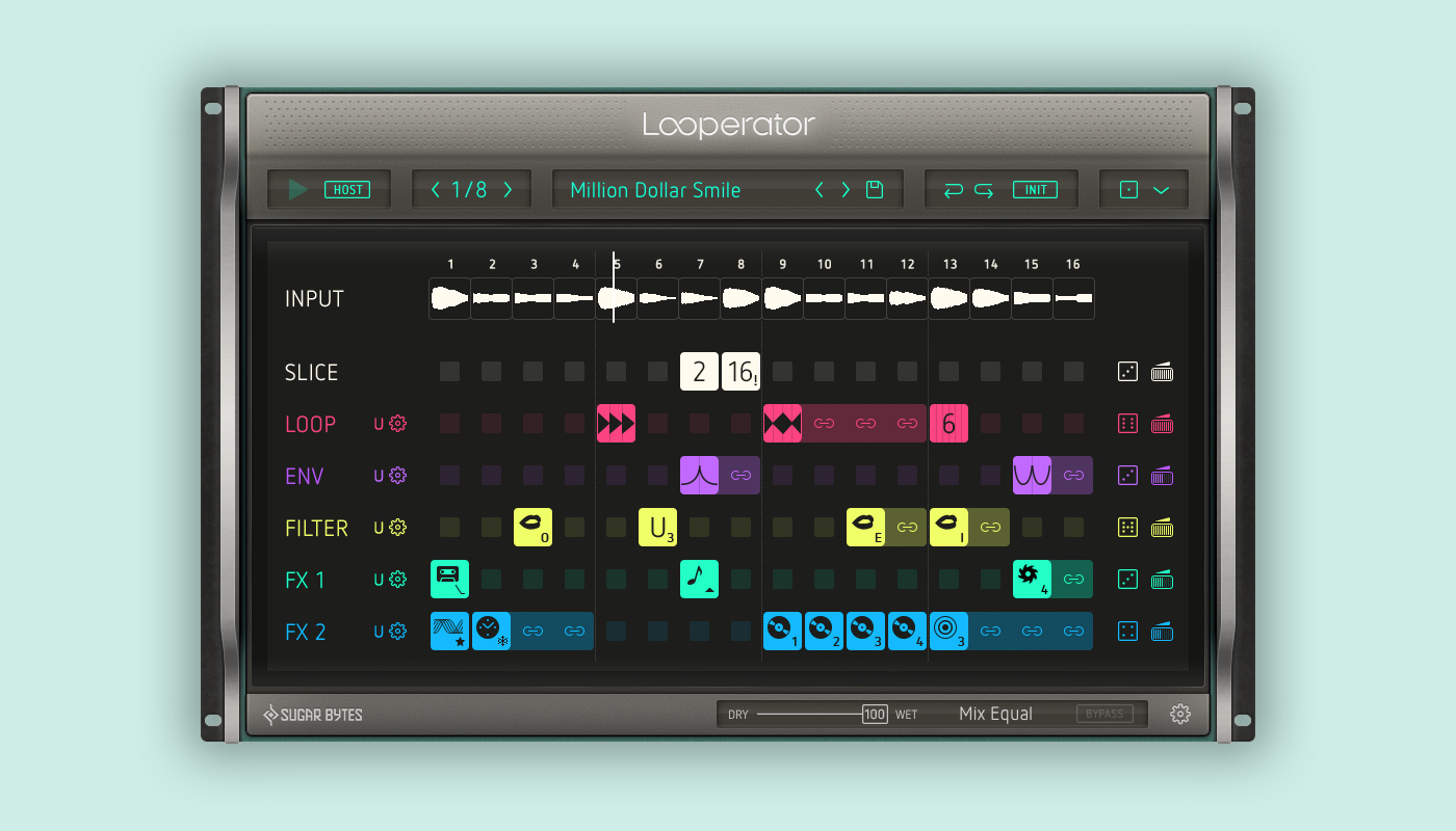
With Looperator, Berlin based audio software studio Sugar Bytes delivers a comprehensive tool for creating musical sound loops. A massive array of effects enables countless possibilities of sound manipulation. At the same time, the user is granted even more control through customised effects. It goes without saying: Only an equally refined interface design will guarantee that this powerful software’s full potential unfolds.
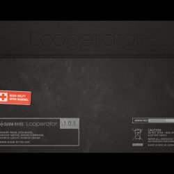
Mondon Design was commissioned with the development of Looperator’s entire visual design: This encompasses a visual language and concept, the graphic user interface design (GUI design) as well as the user experience design (UX design). Furthermore, we created the Looperator logo, respective app icons, promotional material and also the graphics for the software installer. This gave us the opportunity of creating a consistent user experience.
UI Design that’s looking ahead
We design interfaces to be resolution independent. This means, that the interface looks its best on every device. We kept in mind the potential release of Looperator on high-resolution displays (Retina iPad, high-res monitors) right from the start. Already while outlining it in Photoshop, the GUI was completely vector-based. This bares many advantages compared to a pixel-based design, since the whole interface can be scaled easily without suffering any loss in quality. Of course, throughout the process we have to ensure each items visual “functionality” on all resolution levels. Thanks to such standards in our work techniques we are able to very quickly transfer a user interface to another platform – straightforward and uncomplicated.
Efficiency through Reduction
Our work for Looperator is characterised by its high efficiency, especially regarding the conception of the GUI elements: As simple as possible, as complex as necessary. For example, scaling a drop down menu during the development was very quickly possible, since merely a single vector object had to be manipulated. This reduction naturally compelled us to boil the elements’ design down to their essence. A welcome side-effect.
The Process
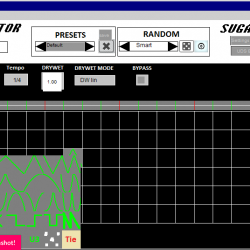
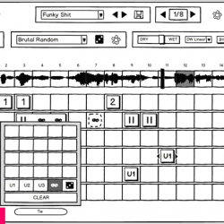
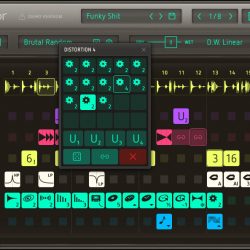
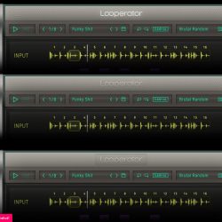
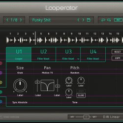
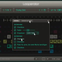
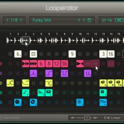
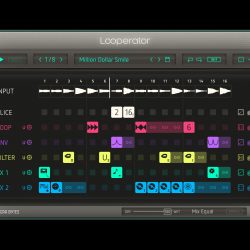
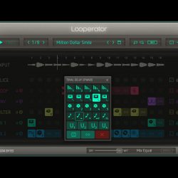
The development of a user interface is an evolutionary process. For the Looperator we initially took a closer look at the software’s alpha version: Where lie it’s strengths and special features? Which situations require that we take the user a little more by the hand? Subsequently, during wireframing we optimised the workflow, suggested additional functions and saw to an intuitive handling. A clear separation of working areas, a coloured guide system and a deliberate arrangement of all controls create a lucid working environment. Speed is trumps: All effects are quickly accessible via popups. While developing, we take great care to observe and respect the user’s learned conventions of operating a software – a special challenge since after all the Looperator strikes a new path at certain points in order to speed up the workflow. It goes without saying that these solutions must work for mouse operation as well as on touch screen devices.
- Alpha Version
- Wireframing
- Icon Konstruktion
- Komposition
- Header Dekoration
- User Settings
- Dialoge
- Interaktionen
Effect Icons Design
The Looperator offers an exceptionally large amount of effects, whose variety should not irritate the user. From scratch, with a newly designed icon set we provide clarity and access. A consistent visual language communicates all functions to the user. Even abstract effects can be precisely identified and assigned. Moreover, a two-level labelling system makes it possible to clearly separate variations of a single effect from one another. The icon design was realised downright minimalistically, but at the same time uses strong visual signals.
Looperator Branding
The aesthetics of sound loops are founded on the principle of repetition. We found an appropriate brand image in the infinity symbol, the Looperator’s main function is key here. The loop is used in the app icon as well as in the Looperator lettering.
Résumé
Essential in our work with Looperator was the task of providing a clear, visually consistent and resolution independent interface for the software, which enables the user to work intuitively and flexibly. Endless possibilities without being overwhelming. Exploring and experimenting or straight to the desired sound. Live use on touch screens and mouse operation in the studio – for us these contrasts too represent the charm of this project. We were able to deliver an interface to Sugar Bytes which is characterised by an incredibly fast workflow – refined down to the very last detail.
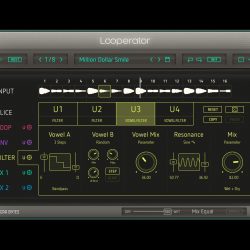
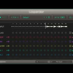
Screenshots
- Playing
- FX Popup
- Browser
- User Settings
- Stille
- Rückseite


New answer